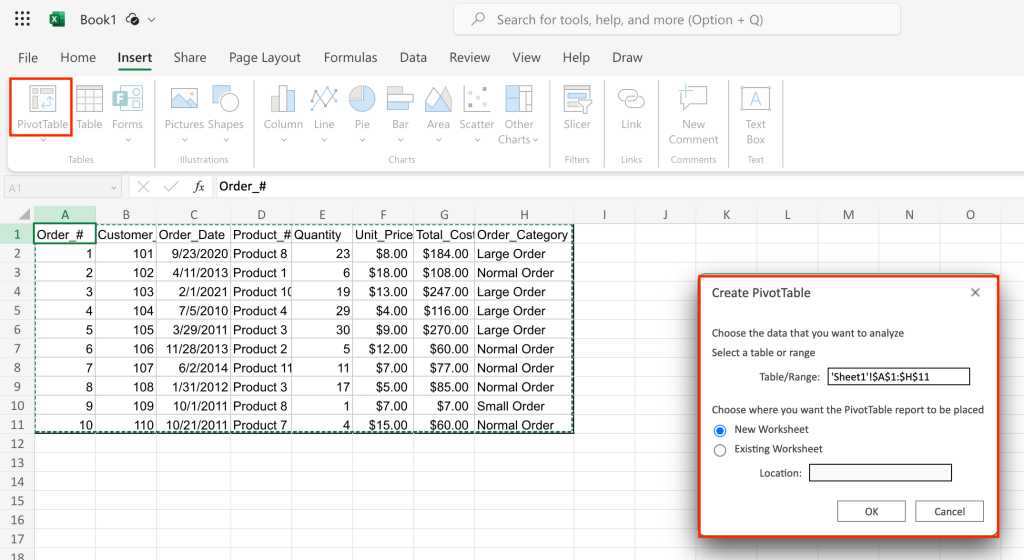
A pop-up appears that lets you select the range of data you want to analyze and where to place the PivotTable. Make sure the whole data set is selected and that the PivotTable will be placed in a new worksheet, then click OK.

Starting a PivotTable in Excel.
Shimon Brathwaite / IDG
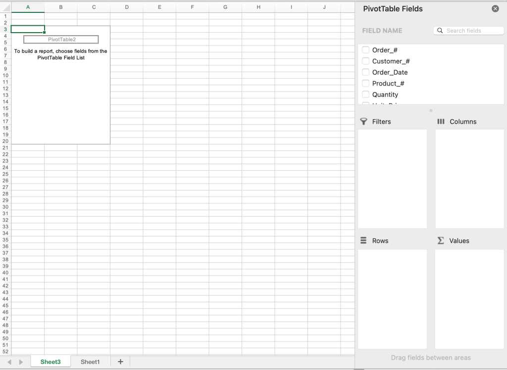
Now we are brought to the starting page for creating a PivotTable. From here, we can begin constructing our first data summary.

Your blank canvas for PivotTable creation.
Shimon Brathwaite / IDG
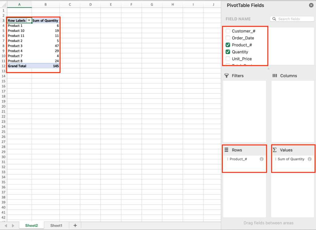
First, we will look at the total quantity of each ordered product. To do this, let’s check the checkbox next to Quantity in the PivotTable Fields sidebar on the right. This will move Quantity into the Values area at the bottom right of the sidebar. Next, drag Product_# into the Rows area to sort by Product_#. The screenshot below shows the result.

This PivotTable shows the quantity of each product type sold.
Shimon Brathwaite / IDG
Here we see a summary of the quantity of products sold by product number and the total quantity of all products sold. You can do this sort of simple analysis with any two variables, but you can also do more fine-grained summaries.
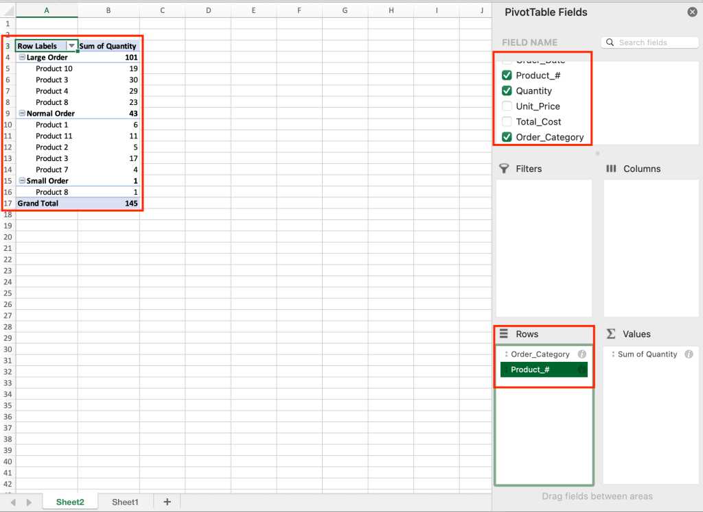
Next, we will add another layer to our analysis by displaying quantity of products by product number and categorizing them by order category. To do this, drag Order_Category into the Rows section of the sidebar and make sure that Order_Category is on top. (You can reorder the items in any area of the sidebar by dragging and dropping them.)

In this version of the PivotTable, another element is shown: Order_Category.
Shimon Brathwaite / IDG
It’s important to understand that you can manipulate how information is shown in the table by the order in which you place the items in any section of the PivotTable. Since we put Order_Category on top of the Rows area, the PivotTable is summarized by that first and then by Product_# inside. To show the opposite sorting, move Product_# to the top in the Rows section and see the result.


